The photo is part of larger one taken by Raymond Wardenær.
Colon between words, I’ve newer seen that before.
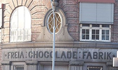
(dot) " FREIA : CHOCKOLADE : FABRIK " (dot)
Written in Norway at a time of large Danish influence to the language.
“Freia” is the brand of the chocolate and “fabrik” is the factory, the actual production site is the building in the picture.
Colon is otherwise used to separate numbers in many systems.
I cannot find (or fully understand?) explanations in online versions of Merriam Webster nor Encyclopedia Britannica.
It may mark a pause or connection between the words, visibly prettier than a “-”. And there’s also a visual connection to the leading and ending dots.
In modern Norwegian these words would be written with the name of the brand separated with a space and the two describing words concatenated, i.e. the separation marker removed: “sjokoladefabrikk” or with the old spelling like “chocoladefabrik”.
Wikipedia:
“In Ethiopia, both Amharic and Ge’ez script used and sometimes still use a colon-like mark as word separator. Historically, a colon-like mark was used as a word separator in Old Turkic script.”
Well then, (some of) the blue eyed people of Scandinavia came all the way from Turkey, but that was too long ago to remember the use of colon as a word separator, I think.
I think Swedish uses colons in some ways that are also unusual to me, including in abbreviations such as “S:t” for Sankt.
The use of dots to separate the words on public inscriptions is very old, seen on Roman monuments too; often they can be a single dot like · this, but there was never a law against using two.
(Look for the Arch of Titus in Rome; all the words are TOGETHERLIKETHISHARDTOREAD, but there are tiny marks separating the words.)
Great, thank you! I’ve found a photo close-up here, not so easy to see in the first place, but the description below the photo shows where to look! https://smarthistory.org/the-arch-of-titus/
BTW, the Swedish colon is described in the Wiki article.
The other interesting thing is, those aren’t really colons — at least, not in a traditional sense. The upper and lower dots are too separated, far higher/lower (respectively) than you’d find in most typographic colons — they’re placed almost exactly even with the baseline and the topmost edge of the capital “E”. A colon may sit on the baseline (or it may be higher), but then its upper dot is typically not far above the centerline.
It’s certainly possible, technically, for a typeface to use such spread-out colons. And I assume there’s at least one font out there somewhere, that could be held up as an example of such a design in practice. Rule 34 applies at least as much to typography as it does to porn.
But what we’re looking at there much more closely resembles U+205A TWO DOT PUNCTUATION, which looks like this — ⁚ Or, in context:
FREIA ⁚ CHOCOLADE ⁚ FABRIK
Unicode’s typically-sparse-and-unhelpful notes on that glyph say:
Notes:
• historically used to indicate the end of a sentence or change of speaker
• extends from baseline to cap height
(“Historically” when? Where? WHOSE history?)
The subblock U+205A occupies within “General Punctuation” is apparently the “Archaic Punctuation” subblock, so that part checks out. It was introduced in 2005 with the release of Unicode version 4.1.